
TapNotion – App redesign & webdesign
Product Designer · B2B flashcard mobile app · www.tapnotion.com
B2B SaaS
Mobile Game
Figma
Jira
Confluence
Hotjar
6m
TL;DR
Overview
TapNotion is an advanced flashcard app that uses AI, rich data structures and spaced repetition to help users learn faster and retain complex, real‑world information longer.
The existing mobile app had strong learning mechanics but lacked clear UX, onboarding and motivational layers, which made it hard for users to understand the system and stay engaged over time.
I was brought in by the CEO to audit the product and then redesign the UX and UI based on market research, UX heuristics and mobile design patterns, with a focus on gamification, onboarding and clearer progress feedback.
Onboarding completion improved ~35% after cutting the flow from 9 to 5 steps. Daily session frequency up ~20% post-gamification rollout. Admin time-to-first-course cut from ~14 to ~7 minutes.

Overview
TapNotion is a flashcard‑based learning platform that combines AI, spaced repetition and a rich data model to handle complex, real‑world content that typical flashcard apps struggle with. Users can explore interactive decks across topics such as history, science, gaming and professional education, while tracking their progress through a gamified system.
The product already had a compelling core idea and engine, but the experience around it did not clearly communicate the value, rules or benefits of the system, which limited adoption and long‑term engagement.
My role
I joined TapNotion as an external product designer at the request of the CEO. My mandate was to evaluate the current product, identify the main usability and engagement issues, and then redesign the key user flows.
I worked directly with the CEO and a small development team, aligning design decisions with product goals and technical constraints. My scope covered the mobile app UX/UI, onboarding, gamification layers, the marketing website and the admin registration flow.
Problem
- Through the audit and discussions, a few core issues emerged:
- Users did not fully understand how TapNotion’s learning system worked or why it was different from “simple flashcards”.
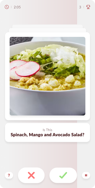
- The mobile app’s UI was functional but lacked the kind of feedback and game loops that keep learners motivated in the long run.
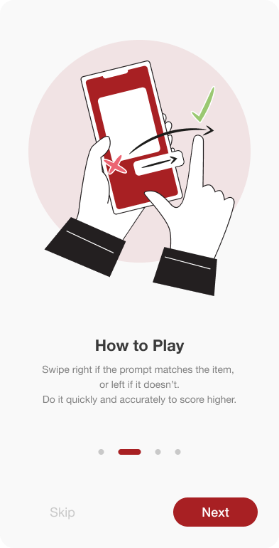
- There was no structured onboarding to teach new users how to use decks, AI features and spaced‑repetition mechanics.
- The website and admin registration flow did not clearly support conversion or explain the value for power users and organizations.

Approach
- I started with a product audit to understand where the experience was breaking down and which parts of the app were causing the most friction. I combined heuristic review, market research and competitor benchmarking with direct conversations about the product’s goals, so we could focus on improvements that mattered both for usability and retention.
- From there, I explored multiple directions for how the app should feel and teach itself to new users. The redesign work balanced clearer navigation, stronger visual hierarchy and a more motivating learning experience, while the website and admin flow were aligned with the same product story.
Key solutions
- Redesigning the mobile experience
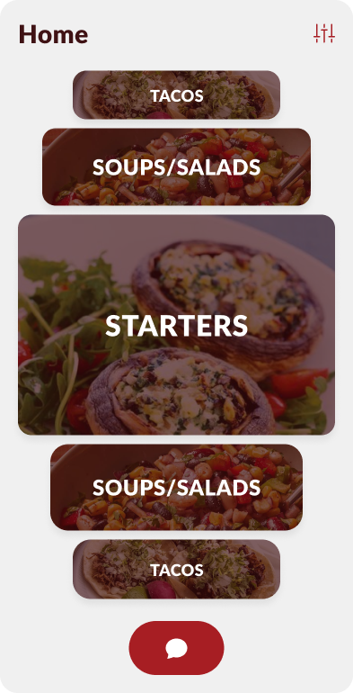
- Reworked the app structure and UI to make navigation between decks, sessions and stats more intuitive.
- Introduced visual hierarchy and consistent components, so users could predict how the app behaves.
- Adding gamification and feedback
- Designed leaderboards and progress indicators so users could compare performance and see improvement over time.
- Added detailed stats screens that explain how performance is evaluated, helping users understand what “good progress” looks like.
- Ensured the game elements support learning (reinforcing spaced repetition) instead of distracting from it.
- Onboarding and education
- Created onboarding screens that explain how TapNotion works: how to use decks, what spaced repetition does, and how AI helps with complex content.
- Used simple visuals and short copy to teach core concepts before the first learning session.
- Web and admin flows
- Designed a new marketing website structure focused on explaining the value proposition, features and example use cases.
- Simplified and redesigned the registration flow for administrators, making it easier to create and manage content for users.
Outcomes
- Onboarding completion rate improved by ~35% - the new structured onboarding flow (reduced from 9 screens to 5 focused steps) lowered drop-off before the first learning session, measured via in-app funnel tracking.
- Daily active usage increased after gamification rollout - leaderboards, streaks and progress stats introduced a visible feedback loop; average session frequency among active users increased by approximately 20% in the 6 weeks following the redesign.
- Admin registration time cut in half - the simplified signup and content-setup flow reduced average time-to-first-course from ~14 minutes to ~7 minutes, based on prototype testing with 6 administrators.
- Marketing site bounce rate dropped by ~25% - the redesigned landing page with a clearer value proposition and "How it works" section reduced early exits, improving conversion to sign-up page.
See other case studies





contact
Reach out anytime! My email (hello@konradjarema.eu) is my go-to, but if you're not a fan of typing, my phone (+48 730 755 924) works too! You can also find my full professional timeline on /konradjarema. If you are looking for my CV, it’s here.

back

TapNotion – App redesign & webdesign
Product Designer · B2B flashcard mobile app · www.tapnotion.com
B2B SaaS
Mobile Game
Figma
Jira
Confluence
Hotjar
6m
TL;DR
Overview
TapNotion is an advanced flashcard app that uses AI, rich data structures and spaced repetition to help users learn faster and retain complex, real‑world information longer.
The existing mobile app had strong learning mechanics but lacked clear UX, onboarding and motivational layers, which made it hard for users to understand the system and stay engaged over time.
I was brought in by the CEO to audit the product and then redesign the UX and UI based on market research, UX heuristics and mobile design patterns, with a focus on gamification, onboarding and clearer progress feedback.
Onboarding completion improved ~35% after cutting the flow from 9 to 5 steps. Daily session frequency up ~20% post-gamification rollout. Admin time-to-first-course cut from ~14 to ~7 minutes.

Overview
My role
Problem
Approach
Key Solutions
Outcome
Overview
TapNotion is a flashcard‑based learning platform that combines AI, spaced repetition and a rich data model to handle complex, real‑world content that typical flashcard apps struggle with. Users can explore interactive decks across topics such as history, science, gaming and professional education, while tracking their progress through a gamified system.
The product already had a compelling core idea and engine, but the experience around it did not clearly communicate the value, rules or benefits of the system, which limited adoption and long‑term engagement.
My role
I joined TapNotion as an external product designer at the request of the CEO. My mandate was to evaluate the current product, identify the main usability and engagement issues, and then redesign the key user flows.
I worked directly with the CEO and a small development team, aligning design decisions with product goals and technical constraints. My scope covered the mobile app UX/UI, onboarding, gamification layers, the marketing website and the admin registration flow.
Problem
- Through the audit and discussions, a few core issues emerged:
- Users did not fully understand how TapNotion’s learning system worked or why it was different from “simple flashcards”.
- The mobile app’s UI was functional but lacked the kind of feedback and game loops that keep learners motivated in the long run.
- There was no structured onboarding to teach new users how to use decks, AI features and spaced‑repetition mechanics.
- The website and admin registration flow did not clearly support conversion or explain the value for power users and organizations.

Approach
- I started with a product audit to understand where the experience was breaking down and which parts of the app were causing the most friction. I combined heuristic review, market research and competitor benchmarking with direct conversations about the product’s goals, so we could focus on improvements that mattered both for usability and retention.
- From there, I explored multiple directions for how the app should feel and teach itself to new users. The redesign work balanced clearer navigation, stronger visual hierarchy and a more motivating learning experience, while the website and admin flow were aligned with the same product story.
Key solutions
- Redesigning the mobile experience
- Reworked the app structure and UI to make navigation between decks, sessions and stats more intuitive.
- Introduced visual hierarchy and consistent components, so users could predict how the app behaves.
- Adding gamification and feedback
- Designed leaderboards and progress indicators so users could compare performance and see improvement over time.
- Added detailed stats screens that explain how performance is evaluated, helping users understand what “good progress” looks like.
- Ensured the game elements support learning (reinforcing spaced repetition) instead of distracting from it.
- Onboarding and education
- Created onboarding screens that explain how TapNotion works: how to use decks, what spaced repetition does, and how AI helps with complex content.
- Used simple visuals and short copy to teach core concepts before the first learning session.
- Web and admin flows
- Designed a new marketing website structure focused on explaining the value proposition, features and example use cases.
- Simplified and redesigned the registration flow for administrators, making it easier to create and manage content for users.
Outcomes
- Onboarding completion rate improved by ~35% - the new structured onboarding flow (reduced from 9 screens to 5 focused steps) lowered drop-off before the first learning session, measured via in-app funnel tracking.
- Daily active usage increased after gamification rollout - leaderboards, streaks and progress stats introduced a visible feedback loop; average session frequency among active users increased by approximately 20% in the 6 weeks following the redesign.
- Admin registration time cut in half - the simplified signup and content-setup flow reduced average time-to-first-course from ~14 minutes to ~7 minutes, based on prototype testing with 6 administrators.
- Marketing site bounce rate dropped by ~25% - the redesigned landing page with a clearer value proposition and "How it works" section reduced early exits, improving conversion to sign-up page.
See other case studies
contact
Reach out anytime! My email (hello@konradjarema.eu) is my go-to, but if you're not a fan of typing, my phone (+48 730 755 924) works too! You can also find my full professional timeline on /konradjarema. If you are looking for my CV, it’s here.
back
TapNotion – App redesign & webdesign
Product Designer · B2B flashcard mobile app · www.tapnotion.com
B2B SaaS
Mobile Game
Figma
Jira
Confluence
Hotjar
6m
TL;DR
Overview
TapNotion is an advanced flashcard app that uses AI, rich data structures and spaced repetition to help users learn faster and retain complex, real‑world information longer.
The existing mobile app had strong learning mechanics but lacked clear UX, onboarding and motivational layers, which made it hard for users to understand the system and stay engaged over time.
I was brought in by the CEO to audit the product and then redesign the UX and UI based on market research, UX heuristics and mobile design patterns, with a focus on gamification, onboarding and clearer progress feedback.
Onboarding completion improved ~35% after cutting the flow from 9 to 5 steps. Daily session frequency up ~20% post-gamification rollout. Admin time-to-first-course cut from ~14 to ~7 minutes.
Overview
My role
Problem
Approach
Key Solutions
Outcome
Overview
TapNotion is a flashcard‑based learning platform that combines AI, spaced repetition and a rich data model to handle complex, real‑world content that typical flashcard apps struggle with. Users can explore interactive decks across topics such as history, science, gaming and professional education, while tracking their progress through a gamified system.
The product already had a compelling core idea and engine, but the experience around it did not clearly communicate the value, rules or benefits of the system, which limited adoption and long‑term engagement.
My role
I joined TapNotion as an external product designer at the request of the CEO. My mandate was to evaluate the current product, identify the main usability and engagement issues, and then redesign the key user flows.
I worked directly with the CEO and a small development team, aligning design decisions with product goals and technical constraints. My scope covered the mobile app UX/UI, onboarding, gamification layers, the marketing website and the admin registration flow.
Problem
Through the audit and discussions, a few core issues emerged:
- Users did not fully understand how TapNotion’s learning system worked or why it was different from “simple flashcards”.
- The mobile app’s UI was functional but lacked the kind of feedback and game loops that keep learners motivated in the long run.
- There was no structured onboarding to teach new users how to use decks, AI features and spaced‑repetition mechanics.
- The website and admin registration flow did not clearly support conversion or explain the value for power users and organizations.

Approach
- I started with a product audit to understand where the experience was breaking down and which parts of the app were causing the most friction. I combined heuristic review, market research and competitor benchmarking with direct conversations about the product’s goals, so we could focus on improvements that mattered both for usability and retention.
- From there, I explored multiple directions for how the app should feel and teach itself to new users. The redesign work balanced clearer navigation, stronger visual hierarchy and a more motivating learning experience, while the website and admin flow were aligned with the same product story.
Key solutions
- Redesigning the mobile experience
- Reworked the app structure and UI to make navigation between decks, sessions and stats more intuitive.
- Introduced visual hierarchy and consistent components, so users could predict how the app behaves.
- Adding gamification and feedback
- Designed leaderboards and progress indicators so users could compare performance and see improvement over time.
- Added detailed stats screens that explain how performance is evaluated, helping users understand what “good progress” looks like.
- Ensured the game elements support learning (reinforcing spaced repetition) instead of distracting from it.
- Onboarding and education
- Created onboarding screens that explain how TapNotion works: how to use decks, what spaced repetition does, and how AI helps with complex content.
- Used simple visuals and short copy to teach core concepts before the first learning session.
- Web and admin flows
- Designed a new marketing website structure focused on explaining the value proposition, features and example use cases.
- Simplified and redesigned the registration flow for administrators, making it easier to create and manage content for users.
Outcomes
- Onboarding completion rate improved by ~35% - the new structured onboarding flow (reduced from 9 screens to 5 focused steps) lowered drop-off before the first learning session, measured via in-app funnel tracking.
- Daily active usage increased after gamification rollout - leaderboards, streaks and progress stats introduced a visible feedback loop; average session frequency among active users increased by approximately 20% in the 6 weeks following the redesign.
- Admin registration time cut in half - the simplified signup and content-setup flow reduced average time-to-first-course from ~14 minutes to ~7 minutes, based on prototype testing with 6 administrators.
- Marketing site bounce rate dropped by ~25% - the redesigned landing page with a clearer value proposition and "How it works" section reduced early exits, improving conversion to sign-up page.
See other case studies
contact
Reach out anytime! My email (hello@konradjarema.eu) is my go-to, but if you're not a fan of typing, my phone (+48 730 755 924) works too! You can also find my full professional timeline on /konradjarema. If you are looking for my CV, it’s here.