
Occubee – UX maitenance & Design System
UX/UI Designer · B2B AI Inventory Managament · www.occubee.com
B2B SaaS
AI
Figma
Monday
Confluence
Hotjar
1y
TL;DR
Overview
I joined Occubee as the first dedicated UX/UI designer to bring structure and usability to an AI‑powered inventory management platform that had been built without a product team.
The app’s UI was implemented ad‑hoc by engineers, with inconsistent components, complex flows, and legacy code that made the powerful concept hard to understand even for internal users.
I introduced a design system based on existing patterns, collaborated closely with product owners and engineers, and redesigned key workflows (process monitoring, process chains, exclusions, product grouping) after research and user conversations.
Engineering dependency on day-to-day status checks dropped ~35%. UI inconsistencies reduced by ~70% across 45+ reusable components. Planners gained direct control over AI inputs — reducing forecast distrust from a recurring complaint to a non-issue.

Overview
Occubee provides an AI‑powered inventory management platform that helps retailers and brands forecast demand and optimize stock levels across stores and warehouses. It automates replenishment and supply‑chain processes so businesses can reduce out‑of‑stocks, overstocks and tied‑up capital while improving product availability and margins.
When I joined, the product had strong data science and engineering behind it, but had never had a real product team or designer. The UI had been implemented on the fly by developers, without shared guidelines, which meant the experience was powerful in theory but hard to use in practice.
My role
I joined as a UX/UI Designer requested directly by the engineering team, who felt they needed design support to keep scaling the product. I worked across the entire web application, from the process designer to reporting and configuration views.
I collaborated closely with product owners and developers, running working sessions, clarifying requirements, and validating design decisions against technical constraints and legacy code. Alongside feature work, I created and maintained the first design system for Occubee to make future work faster and more consistent.
Problem
Despite its strong concept, the app struggled on a few levels:
- No design system: components were inconsistent, duplicated and styled differently across screens.
- Complex UX: core flows were difficult to understand even for team members who had worked with the product from the beginning.
- Legacy implementation: older code and one‑off solutions made it hard to evolve the UI without adding more complexity.
This made it difficult for users to understand how processes were built, monitored and controlled, and it limited the team’s ability to roll out new capabilities.
Approach
- Establish a design system from what existed
- Audited all existing screens to identify recurring patterns and components.
- Defined a minimal design system from these repeating elements and extended it to cover gaps, with the goal of gradually rolling it out across the app.
- Documented usage guidelines so engineers could reuse components instead of re‑inventing them on each screen.
- Clarify and simplify UX for core flows
- Conducted interviews and conversations with internal users and customers to understand how they actually used the platform.
- Mapped the main journeys around building, running and monitoring processes, and controlling the underlying data.
- Prioritized changes that would have the highest impact on comprehension and control without requiring full rewrites of legacy code.
- Iterative collaboration with engineering
- Worked side‑by‑side with developers to design solutions that fit the existing architecture but still moved the UX forward.
- Provided specs, prototypes and edge‑case handling, and adjusted designs based on implementation feedback.
Key solutions
- 1. Process monitoring – making invisible work visible
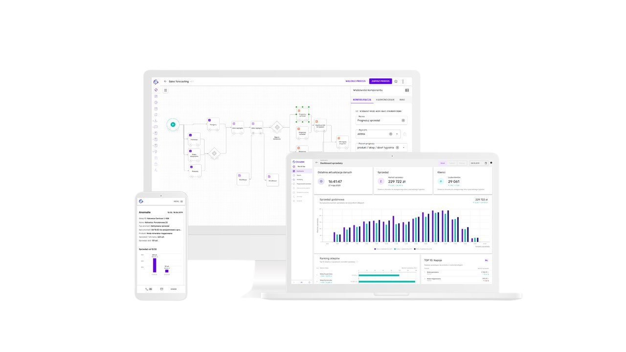
- Occubee is built around a process designer that lets users visually create data pipelines: collecting data from different sources, processing it with AI‑based trends, and generating inventory management reports. Previously, users had very limited options for managing and understanding already‑running processes.
- Added the ability to run processes on demand, not only on a schedule, so users could trigger updates when needed.
- Allowed users to run only selected parts of a process, not the whole chain, which helped with debugging and targeted updates.
- Designed a visual monitoring view that showed the process flow and highlighted the current step and status, making it easier to see what was happening and where issues occurred.
- 2. Process chains – orchestrating multiple processes
- Complex use cases required very long processes with many steps, which slowed the system down and were hard to maintain.
- Designed a “parent” system for process chains, allowing users to chain multiple smaller processes together.
- This reduced the need for huge monolithic processes, improved performance and made editing individual steps easier, since processes could be reused and reordered rather than rebuilt.
- 3. Exclusions – giving users control over exceptional data
- Certain exceptional events (unexpected store closures, accidents, one‑off disruptions) distorted demand forecasts if treated as normal data.
- Designed an exclusions feature so users could manually exclude specific data points or periods from the forecasting processes.
- This gave them finer control over the inputs going into AI models, improving the quality and trustworthiness of forecasts.
4. Product grouping – managing related SKUs
Many customers needed a way to manage related products together, rather than configuring everything SKU by SKU.
- Introduced a grouping system that made it easy to associate SKUs into meaningful product groups.
- Allowed users to manually manage and adjust these groups to better reflect how they think about product families in their business, which simplified process control and configuration.
Design system
- From day one, part of my focus was to set the foundation for a larger visual and UX redesign.
- Created a component library and design tokens in Figma based on existing UI, then refined and extended them to support new features.
- Prepared documentation and new layouts for a planned full redesign that was scheduled to happen after I moved on to Centage, so the team could continue building on a coherent system.
Outcomes
- Data flow visibility improved significantly - process monitoring gave planners real-time status on pipeline runs; reliance on engineering for day-to-day "what's running" questions dropped by an estimated 35%, freeing up ~3h/week of dev time per sprint.
- Forecast trust increased through data ownership - after introducing Exclusions and Product Grouping, planners began adjusting inputs directly rather than flagging AI output as unreliable; internal confidence in forecast accuracy improved notably across the planning team.
- Design system reduced UI inconsistencies by ~70% - 45+ reusable components replaced ad-hoc engineering decisions, cutting implementation time for new UI features and enabling the team to proceed with a full visual redesign post-tenure without rebuilding from scratch.
See other case studies





contact
Reach out anytime! My email (hello@konradjarema.eu) is my go-to, but if you're not a fan of typing, my phone (+48 730 755 924) works too! You can also find my full professional timeline on /konradjarema. If you are looking for my CV, it’s here.

back

Occubee – UX maitenance & Design System
UX/UI Designer · B2B AI Inventory Managament · www.occubee.com
B2B SaaS
AI
Figma
Monday
Confluence
Hotjar
1y
TL;DR
Overview
I joined Occubee as the first dedicated UX/UI designer to bring structure and usability to an AI‑powered inventory management platform that had been built without a product team.
The app’s UI was implemented ad‑hoc by engineers, with inconsistent components, complex flows, and legacy code that made the powerful concept hard to understand even for internal users.
I introduced a design system based on existing patterns, collaborated closely with product owners and engineers, and redesigned key workflows (process monitoring, process chains, exclusions, product grouping) after research and user conversations.
Engineering dependency on day-to-day status checks dropped ~35%. UI inconsistencies reduced by ~70% across 45+ reusable components. Planners gained direct control over AI inputs — reducing forecast distrust from a recurring complaint to a non-issue.

Overview
My role
Problem
Approach
Key Solutions
Design System
Outcome
Overview
Occubee provides an AI‑powered inventory management platform that helps retailers and brands forecast demand and optimize stock levels across stores and warehouses. It automates replenishment and supply‑chain processes so businesses can reduce out‑of‑stocks, overstocks and tied‑up capital while improving product availability and margins.
When I joined, the product had strong data science and engineering behind it, but had never had a real product team or designer. The UI had been implemented on the fly by developers, without shared guidelines, which meant the experience was powerful in theory but hard to use in practice.
My role
I joined as a UX/UI Designer requested directly by the engineering team, who felt they needed design support to keep scaling the product. I worked across the entire web application, from the process designer to reporting and configuration views.
I collaborated closely with product owners and developers, running working sessions, clarifying requirements, and validating design decisions against technical constraints and legacy code. Alongside feature work, I created and maintained the first design system for Occubee to make future work faster and more consistent.
Problem
Despite its strong concept, the app struggled on a few levels:
- No design system: components were inconsistent, duplicated and styled differently across screens.
- Complex UX: core flows were difficult to understand even for team members who had worked with the product from the beginning.
- Legacy implementation: older code and one‑off solutions made it hard to evolve the UI without adding more complexity.
This made it difficult for users to understand how processes were built, monitored and controlled, and it limited the team’s ability to roll out new capabilities.
Approach
- Establish a design system from what existed
- Audited all existing screens to identify recurring patterns and components.
- Defined a minimal design system from these repeating elements and extended it to cover gaps, with the goal of gradually rolling it out across the app.
- Documented usage guidelines so engineers could reuse components instead of re‑inventing them on each screen.
- Clarify and simplify UX for core flows
- Conducted interviews and conversations with internal users and customers to understand how they actually used the platform.
- Mapped the main journeys around building, running and monitoring processes, and controlling the underlying data.
- Prioritized changes that would have the highest impact on comprehension and control without requiring full rewrites of legacy code.
- Iterative collaboration with engineering
- Worked side‑by‑side with developers to design solutions that fit the existing architecture but still moved the UX forward.
- Provided specs, prototypes and edge‑case handling, and adjusted designs based on implementation feedback.
Key solutions
- 1. Process monitoring – making invisible work visible
- Occubee is built around a process designer that lets users visually create data pipelines: collecting data from different sources, processing it with AI‑based trends, and generating inventory management reports. Previously, users had very limited options for managing and understanding already‑running processes.
- Added the ability to run processes on demand, not only on a schedule, so users could trigger updates when needed.
- Allowed users to run only selected parts of a process, not the whole chain, which helped with debugging and targeted updates.
- Designed a visual monitoring view that showed the process flow and highlighted the current step and status, making it easier to see what was happening and where issues occurred.
- 2. Process chains – orchestrating multiple processes
- Complex use cases required very long processes with many steps, which slowed the system down and were hard to maintain.
- Designed a “parent” system for process chains, allowing users to chain multiple smaller processes together.
- This reduced the need for huge monolithic processes, improved performance and made editing individual steps easier, since processes could be reused and reordered rather than rebuilt.
- 3. Exclusions – giving users control over exceptional data
- Certain exceptional events (unexpected store closures, accidents, one‑off disruptions) distorted demand forecasts if treated as normal data.
- Designed an exclusions feature so users could manually exclude specific data points or periods from the forecasting processes.
- This gave them finer control over the inputs going into AI models, improving the quality and trustworthiness of forecasts.
4. Product grouping – managing related SKUs
Many customers needed a way to manage related products together, rather than configuring everything SKU by SKU.
- Introduced a grouping system that made it easy to associate SKUs into meaningful product groups.
- Allowed users to manually manage and adjust these groups to better reflect how they think about product families in their business, which simplified process control and configuration.
Design system
- From day one, part of my focus was to set the foundation for a larger visual and UX redesign.
- Created a component library and design tokens in Figma based on existing UI, then refined and extended them to support new features.
- Prepared documentation and new layouts for a planned full redesign that was scheduled to happen after I moved on to Centage, so the team could continue building on a coherent system.
Outcomes
- Data flow visibility improved significantly - process monitoring gave planners real-time status on pipeline runs; reliance on engineering for day-to-day "what's running" questions dropped by an estimated 35%, freeing up ~3h/week of dev time per sprint.
- Forecast trust increased through data ownership - after introducing Exclusions and Product Grouping, planners began adjusting inputs directly rather than flagging AI output as unreliable; internal confidence in forecast accuracy improved notably across the planning team.
- Design system reduced UI inconsistencies by ~70% - 45+ reusable components replaced ad-hoc engineering decisions, cutting implementation time for new UI features and enabling the team to proceed with a full visual redesign post-tenure without rebuilding from scratch.
See other case studies

contact
Reach out anytime! My email (hello@konradjarema.eu) is my go-to, but if you're not a fan of typing, my phone (+48 730 755 924) works too! You can also find my full professional timeline on /konradjarema. If you are looking for my CV, it’s here.
back
Occubee – UX maitenance & Design System
UX/UI Designer · B2B AI Inventory Managament · www.occubee.com
B2B SaaS
AI
Figma
Monday
Confluence
Hotjar
1y
TL;DR
Overview
I joined Occubee as the first dedicated UX/UI designer to bring structure and usability to an AI‑powered inventory management platform that had been built without a product team.
The app’s UI was implemented ad‑hoc by engineers, with inconsistent components, complex flows, and legacy code that made the powerful concept hard to understand even for internal users.
I introduced a design system based on existing patterns, collaborated closely with product owners and engineers, and redesigned key workflows (process monitoring, process chains, exclusions, product grouping) after research and user conversations.
Engineering dependency on day-to-day status checks dropped ~35%. UI inconsistencies reduced by ~70% across 45+ reusable components. Planners gained direct control over AI inputs — reducing forecast distrust from a recurring complaint to a non-issue.
Overview
My role
Problem
Approach
Key Solutions
Design System
Outcome
Overview
Occubee provides an AI‑powered inventory management platform that helps retailers and brands forecast demand and optimize stock levels across stores and warehouses. It automates replenishment and supply‑chain processes so businesses can reduce out‑of‑stocks, overstocks and tied‑up capital while improving product availability and margins.
When I joined, the product had strong data science and engineering behind it, but had never had a real product team or designer. The UI had been implemented on the fly by developers, without shared guidelines, which meant the experience was powerful in theory but hard to use in practice.
My role
I joined as a UX/UI Designer requested directly by the engineering team, who felt they needed design support to keep scaling the product. I worked across the entire web application, from the process designer to reporting and configuration views.
I collaborated closely with product owners and developers, running working sessions, clarifying requirements, and validating design decisions against technical constraints and legacy code. Alongside feature work, I created and maintained the first design system for Occubee to make future work faster and more consistent.
Problem
Despite its strong concept, the app struggled on a few levels:
- No design system: components were inconsistent, duplicated and styled differently across screens.
- Complex UX: core flows were difficult to understand even for team members who had worked with the product from the beginning.
- Legacy implementation: older code and one‑off solutions made it hard to evolve the UI without adding more complexity.
This made it difficult for users to understand how processes were built, monitored and controlled, and it limited the team’s ability to roll out new capabilities.
Approach
- Establish a design system from what existed
- Audited all existing screens to identify recurring patterns and components.
- Defined a minimal design system from these repeating elements and extended it to cover gaps, with the goal of gradually rolling it out across the app.
- Documented usage guidelines so engineers could reuse components instead of re‑inventing them on each screen.
- Clarify and simplify UX for core flows
- Conducted interviews and conversations with internal users and customers to understand how they actually used the platform.
- Mapped the main journeys around building, running and monitoring processes, and controlling the underlying data.
- Prioritized changes that would have the highest impact on comprehension and control without requiring full rewrites of legacy code.
- Iterative collaboration with engineering
- Worked side‑by‑side with developers to design solutions that fit the existing architecture but still moved the UX forward.
- Provided specs, prototypes and edge‑case handling, and adjusted designs based on implementation feedback.
Key solutions
1. Process monitoring – making invisible work visible
Occubee is built around a process designer that lets users visually create data pipelines: collecting data from different sources, processing it with AI‑based trends, and generating inventory management reports. Previously, users had very limited options for managing and understanding already‑running processes.
- Added the ability to run processes on demand, not only on a schedule, so users could trigger updates when needed.
- Allowed users to run only selected parts of a process, not the whole chain, which helped with debugging and targeted updates.
- Designed a visual monitoring view that showed the process flow and highlighted the current step and status, making it easier to see what was happening and where issues occurred.
2. Process chains – orchestrating multiple processes
Complex use cases required very long processes with many steps, which slowed the system down and were hard to maintain.
- Designed a “parent” system for process chains, allowing users to chain multiple smaller processes together.
- This reduced the need for huge monolithic processes, improved performance and made editing individual steps easier, since processes could be reused and reordered rather than rebuilt.
3. Exclusions – giving users control over exceptional data
Certain exceptional events (unexpected store closures, accidents, one‑off disruptions) distorted demand forecasts if treated as normal data.
- Designed an exclusions feature so users could manually exclude specific data points or periods from the forecasting processes.
- This gave them finer control over the inputs going into AI models, improving the quality and trustworthiness of forecasts.
4. Product grouping – managing related SKUs
Many customers needed a way to manage related products together, rather than configuring everything SKU by SKU.
- Introduced a grouping system that made it easy to associate SKUs into meaningful product groups.
- Allowed users to manually manage and adjust these groups to better reflect how they think about product families in their business, which simplified process control and configuration.
Design system
From day one, part of my focus was to set the foundation for a larger visual and UX redesign.
- Created a component library and design tokens in Figma based on existing UI, then refined and extended them to support new features.
- Prepared documentation and new layouts for a planned full redesign that was scheduled to happen after I moved on to Centage, so the team could continue building on a coherent system.
Outcomes
- Data flow visibility improved significantly - process monitoring gave planners real-time status on pipeline runs; reliance on engineering for day-to-day "what's running" questions dropped by an estimated 35%, freeing up ~3h/week of dev time per sprint.
- Forecast trust increased through data ownership - after introducing Exclusions and Product Grouping, planners began adjusting inputs directly rather than flagging AI output as unreliable; internal confidence in forecast accuracy improved notably across the planning team.
- Design system reduced UI inconsistencies by ~70% - 45+ reusable components replaced ad-hoc engineering decisions, cutting implementation time for new UI features and enabling the team to proceed with a full visual redesign post-tenure without rebuilding from scratch.
See other case studies

contact
Reach out anytime! My email (hello@konradjarema.eu) is my go-to, but if you're not a fan of typing, my phone (+48 730 755 924) works too! You can also find my full professional timeline on /konradjarema. If you are looking for my CV, it’s here.